This page is an introduction to our projects, and shows some of the visualizations that we believe describe our data as a whole. The analyses presented here are only part of our overall project; we invite you to read read our paper if you are interested in the full in-depth analysis.
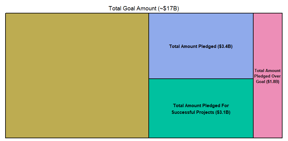
This is a graph that compares the amount of money asked for by projects with the amount of money actually pledged to them. The entire area of all of the boxes combined represents, roughly, seventeen billion U.S. dollars; the total amount asked for by all Kickstarter projects. The area in blue shows the total amount of money pledged to all Kickstarter projects. The area of the green box represents the amount of money pledged to successful Kickstarter projects. Finally, the pink box represents the amount of money pledged to Kickstarter projects who have already reached their goal. For example, if you ask for $6,000 and you get $8,000, $2,000 would be added to the area of the pink box. The areas are all relative to each other and are meant to enhance your understanding of the relative sizes of these sums of money.
This project explores what a successful Kickstarter project looks like and how these traits could possibly be replicated in future projects.
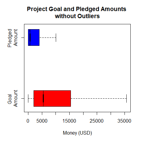
The figure shows one of the main issues most Kickstarter projects face, receiving less than they ask for. While most Kickstarter projects ask for $15,000 or less, in actuality most are receiving $5,500 or less. This explains why only 36% of all Kickstarter projects are successful. Something to note is that this figure does not include outliers, and many projects are asking for hundreds of millions of dollars while many are receiving hundreds of thousands. So how does a Kickstarter project move from failing their goal, to well past exceeding it?
In our paper, we explore many possible factors that could contribute to the success or failure of a Kickstarter project. These factors include category, year, country, the set goal, the words used in the blurb, and a few others. Please give it a read and good luck to all potential project creators out there! We hope we can help you!
Kickstarter divides projects up into a number of categories. Originally, creators were free to enter whatever they wanted for the category, but sometime between 2016 and 2018, they switched to a pre-defined set of categories, and existing projects with custom categories were assigned to one of the pre-defined ones.
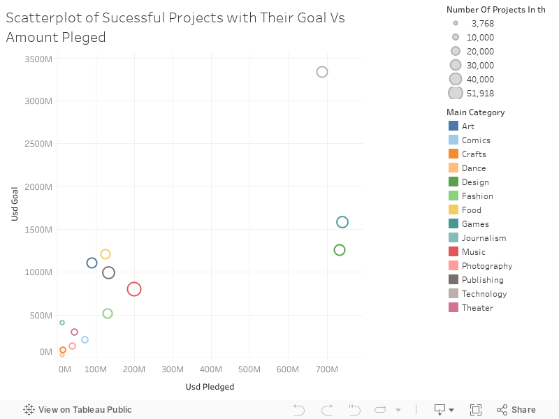
Here, we look at the total of all the goal amounts for each category compared to the total amount of money pledged for that category. Generally, we see that categories that ask for more tend to get more, as we would expect, particularly Technology, which both asks for and receives far more than other categories.
Notably, we see two categories that get significantly more money for what they ask for compared to the others. These appear at the right of the scatterplot and are Design and Games. Note that this does not mean that they made significantly more than their goals. Despite being so far from the others, the total pledged amount is still fairly disparate from the total goal amount. There is no category where overall more money was pledged than the goal amount.
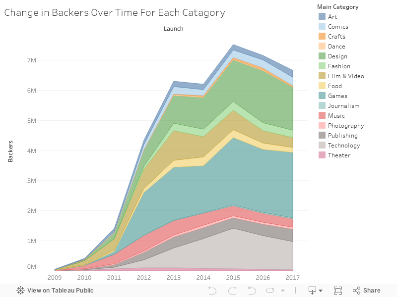
Our data runs from the year 2009 to the beginning of 2018, so we also performed some analyses across this time period. Here, we show the number of backers (that is, the count, not the amount they pledged) in each category.
Most categories show pretty quick growth in the early years of 2009 through 2013. From 2011 to 2012, several categories, notably games, experienced a large spike in backers along with the overall, but note that some categories remained fairly constant despite the big change in the platform's growth.
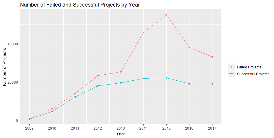
The above also relates to a big spike in failed projects in 2015. This graph shows this huge spike, but also shows that the number of successful projects remained relatively close to trend. Of course, if one totals these up, it demonstrates that there is also a huge spike in the number of projects overall in 2015. We believe that 2015 was the year that the growth of backers ran out. In other words, while the growth of the number of projects exploded, the growth of the number of backers started leveling out, which is why the spike in the number of projects mostly ended up with failed projects.
As we mentioned before, if you're interested in our full analysis, please check out our paper.